September 23, 2014

Background selection

As I mentioned in my previous post, I am in the beginning stages of a pickle dish quilt.  I've selected quite a few fabrics, but I still need to settle on a background fabric.

Here are my fabrics so far:


My plan is to use the first two rows for the arcs, the bottom row for the four-patches, and the navies for the footballs.  (I plan to add to this, and maybe remove a few as well.)

While I'm not ready to jump headlong into this yet, I did stitch up a few arcs to use in auditioning background fabrics.  I photographed these against a white background, then used photo editing tools to fill the background with images from some potential background fabrics.  Here's the original photo:


I tried quite a few possibilities.  To keep this post from being photo overload, I created a few collages of the various choices.  (The combined images look like a different quilt idea, but that is not my intent.)  Also, my method of importing the background images might not result in the correct scale for the prints.

Here is my first group of four choices:


I think either of the first two would work, but neither seems particularly daring to me.  I had high hopes for these Amy Butler fabrics (3 and 4), until I imported them next to the arcs.  I don't think I care for either of these in this quilt.


Number 5 is an upcoming Alison Glass print.  I like the variations in the color, and I sort of like the tan, but I'm not sure about the spots.  (I may use the navy version of this for some footballs.)  Number 6 is Quilters Linen; I like the color, but I don't know what to expect as far as texture.  I'm afraid it might be too plain.

I really like the look of number 7, except it doesn't have enough contrast with the pink arc sections.  I might consider a lighter Grunge if I could see it in person.  Number 8 would work too, and I like the fabric itself, but it's not really the look I want for this quilt.  (I've used a lot of texty and similar fabrics as backgrounds, and I'd like to branch out a bit.)


Number 9 is not at all what I had in mind for this quilt, but it's near the top of my list.  Number 10 seems even more off the wall; maybe too much so?  I sort of like it at this scale, but if the scale is much larger in reality I wouldn't want to use this.

Number 11 is a creamy version of number 9.  I love the tonal variations of this one, but I'm afraid it might still be too plain.  Number 12 is a text print (I know, I said I'm trying to stay away from those).  I think this one might just be too green, although it is hard to tell with computer images.

I tried quite a few other images, but those above were my favorites.  I also noticed Kate Spain has announced a new line (Paradiso) with colors that might fit well with this quilt, but I have not seen any digital swatches.

I'd love to hear your thoughts about any of the choices above.

I'm linking up with Lee for WIP Wednesday.

September 3, 2014

Football Season

I thought I'd share how I made some templates for an upcoming quilt project...

I'm starting a pickle dish quilt based on the design in Kaffe Fassett's Quilt Romance. My first step was to carefully cut the pattern pages from the book so I could lay them flat on a scanner bed.


I scanned the pages and printed the shapes I wanted to use for templates (pieces B and C), being careful to keep the sizes unchanged.  I cut the shapes out roughly, leaving a margin around the edge, then I used basting spray to temporarily affix them to the underside of a piece of template plastic.

I traced the markings I wanted to keep onto the template plastic using a fine-tipped permanent marker.  I didn't really need the seam lines except for the straight edges of the background piece -- I plan to cut those on a fold.  For the alignment marks, I used a drill press to make holes in the plastic at the given locations.  I found that a 5/64" hole works well to allow a Frixion marker to draw an alignment dot on the fabric.


I used a utility knife and an old cutting board to trim the template shapes along the cutting lines.  This template plastic is too thin to use as a cutting guide with a rotary cutter, so I traced around the shapes on the back side of my fabric then cut them out "freehand."  I stacked several fabrics to cut at once, which was a little frustrating with a rotary cutter and no ruler.  I found it easier to pin the fabrics together (after a rough straight cut to separate each piece) and cut with scissors.


For the underlying fabrics, I aligned the template on the cut pieces to transfer the alignment marks.

I also scanned the fan shape to print on foundation paper.  I was able to just fit two shapes on legal size paper:


I expect this to be a long-term project.  I'm still collecting fabrics for this, and have yet to decide on background fabric.  That might be a subject for a future post.

I'm linking up with Lee at Freshly Pieced for WIP Wednesday.

And by the way... War Eagle!

August 21, 2014

Twin Rocket Age Quilts


When I first saw Riley Blake's "Rocket Age" fabrics in the coming-soon section of some online shops, I knew I wanted to make use of it.  I decided to use the Lullaby Lane quilt pattern by Sassafras Lane Designs to make a quilt for a baby boy, without a particular recipient in  mind.  I was undecided as to exactly which prints and solids I wanted to use, so I ordered some alternatives too.  I pieced a top together up to the point of needing the applique, and set it aside.

Then twin boys came along, and I realized I had enough fabric to make two quilts.


The first quilt uses Kona Windsor as the solid sashing, with a blue stripe from Henley Studio as the applique background, and a solid red binding:


The other quilt uses Kona Orange for the sashing, a Rocket Age stripe for the applique background, and the Henley Studio blue stripe for binding:


I really like that stripe as binding; here's a detail shot showing some of the backing fabric too:


For the applique, instead of the blanket stitch I typically use, I opted for a sketch stitch.  I felt it was in keeping with the comic book style of the prints.  I made a pattern for the rocket by scanning the fabric and modifying one of the rocket shapes in Photoshop.


I did trapunto under the rockets, but I waited until after completing the background quilting to fuse the letters to the top, to have less starts and stops in the quilting.  I did spiral quilting for the first quilt, marking the first rounds and quilting with free motion, then using a walking foot to complete the larger rounds.  (See the top photo above.)


The other quilt is quilted in straight lines in a chevron shape; the inner section has lines 1/2 inch apart, while the outer lines are 1 inch apart.


I really like the comic book ads print used on the back.  I think I remember some of those ads from my comic books years ago.


I hope these baby boys enjoy their quilts!


(I'm linking up with Crazy Mom Quilts.)


August 19, 2014

A Birthday Gift

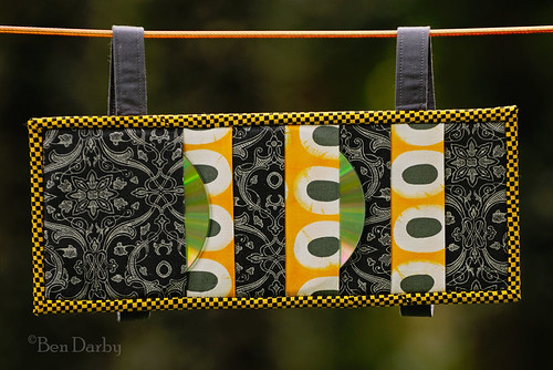
I made a visor CD organizer for my teenage musician daughter, at her request, and gave it to her for her birthday.


I used the tutorial here, and added straps.  The fabrics are from "Jazz Jam" by Andover, plus a Basic Grey print.  My daughter plays piano and clarinet, so I was glad to feature them via easy fussy cuts.

Here's the back:


It's on the visor of her car now.

I made one for myself a couple of years ago:

Visor CD Holder

August 11, 2014

A Pastoral Gift

Our pastor for the past 12 years recently retired, after 35 years of ministerial service.  In appreciation for what he and his wife have meant to our family, I made this mini-quilt for them.


The design is based on our church's logo:


I scanned the logo and "traced" it in Photoshop to draft a pattern.  I used paper piecing for the "stained glass" sections.  To achieve this, I straightened the gentle curves in those areas.  The background sections required curved piecing.  The inner curves were pretty tight; I figure if I can do those, I should be ready to start a pickle dish quilt.

The background fabric is Cotton Couture in Teal.  The "glass" pieces are all Kona solids: Chartreuse, Lime, Ivy, Turquoise, and (I think) Lagoon and Caribbean

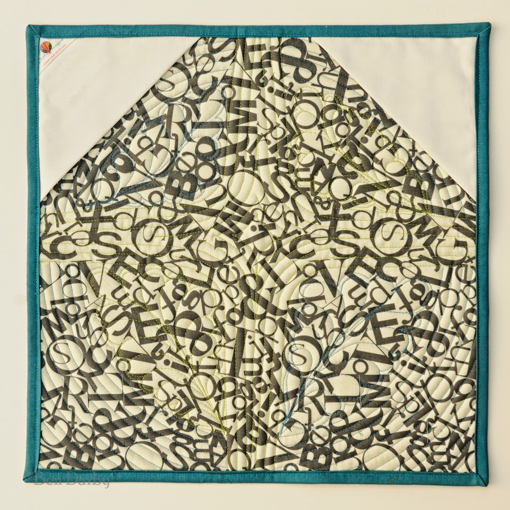
Here's the back:


I signed it in the upper left, along with a note (I've cloned that part out).  I included a dowel which slips into the triangular pockets for hanging.  The backing fabric has a little bit of significance which I expect our pastor will recognize. 
 
 
My wife and I presented the gift to them yesterday at a retirement celebration.  We will miss them, as they are moving to a different state, but we wish them well in their next venture.

July 23, 2014

My Mother's Quilt

My mother did a lot of sewing, but I only remember her working on one quilt.  In the early 1960s, when I was a small boy, I can remember her doing applique and embroidery on this top.  She put it away unfinished for a long time.  When she was diagnosed with terminal cancer in the mid '70s, she got it back out and tried to finish it.


She was unable to complete it, though.  After her death, my mother's sister finished the small amount of remaining applique and embroidery, and community members quilted it.


This quilt was from a kit, with the designs pre-stamped on the fabric.  I don't have any other information about it; if anyone knows where it might have originated, please let me know. [Edit July 2025 -- I've found that the quilt was made by the Progress quilt kit company, and the kit is their number 1404, "Apple Blossom." I cannot find a date of publication for this kit.]


My father used it on his bed for a few years.  I could find one worn spot on it, and it has a couple of small stains.  It is stored in my closet now as one of my prized possessions.

June 5, 2014

Ode to Joy

About a year ago, our local symphony presented a performance of Beethoven's Symphony No. 9, and I had the wonderful privilege of singing in the chorus.  About the same time, my daughter ran across a craft idea on Pinterest which involved using vintage sheet music to form letters on canvas.  These two events inspired me to make this quilt:


I used a fat quarter pack of Chicopee by Denyse Schmidt, plus some neutral fabrics from Eclectic Elements by Tim Holtz and Sweet Serenade by BasicGrey, and a few other colored prints.  I also designed a few fabrics of my own and had them printed from Spoonflower.


If you are unfamiliar with Beethoven's 9th Symphony, this masterpiece incorporates text from Friedrich Schiller's "An die Freude," or "Ode to Joy."  The hymn "Joyful, Joyful, We Adore Thee" uses music from the symphony.  Maybe you have seen this flash mob version of the symphony's finale.

The quilt rows are 48 inches wide, so for the block-based rows I used block sizes that are divisors of 48 (12 inches, 8 inches, 6 inches, etc.).  I tried to choose blocks that seem to have a sense of joy to them.  The New York Beauty blocks were inspired by a quilt I saw on Flickr.


The friendship stars are 3 inches finished, and are made up of 1-inch squares.  This tested my quarter-inch seam accuracy more than I anticipated -- I had to fudge this row a bit.

I used techniques from Tonya Ricucci's Word Play Quilts to piece the word "FREUDE."


The snail's trail blocks, like the New York Beauties, were paper pieced.  I quilted most of these blocks with a spiral, but I included some text in one:


9-patch blocks seemed a natural for this quilt.  I quilted "IX" in the ninth 9-patch.  The background fabric here is one of my Spoonflower prints, which incorporates scans from the choral part.  Some of my pencilled marks in the music even made it into the fabric.


Then comes a row of sawtooth stars.  This one's center is another of my Spoonflower fabrics.


The dark strip below the stars is actually text from Schiller's poem, formed by fussy-cuts from a Tim Holtz stamp fabric.  The row spells out "ALLE MENSCHEN WERDE BREUDER."


I designed my own pattern for paper piecing the music notes.


The final row uses a couple of traditional 12-inch block designs.


For the colored border, I pieced together strips of random width, then cross-cut the strip sets to 1.5 inches.  (I had enough left over to use in a couple of smaller quilts.)  I quilted this border with text from the poem.


For the outer border, I had purchased a music-themed fabric, but it just didn't seem to work well with the rest once I had the main part assembled.  Instead I used one the Eclectic Elements fabrics.  It has French text in the design, which doesn't fit exactly with the theme, but I'm happy with the overall look.  (Maybe chocolat fits with the theme of joy, at least?)


Similarly, my first purchase for the binding fabric didn't work out either.  It too had music notes on it, but it was dark brown and I felt the binding needed color.


The backing is another Tim Holtz fabric, the same fabric I used in the background of the music notes.  I am really pleased with this choice.


Here are a few more views of the quilt:


I hope that's not photo overload.  I think that's how my daughter felt as she was helping with the photo shoot.


I'm linking up with crazy mom quilts for Finish It Up Friday.